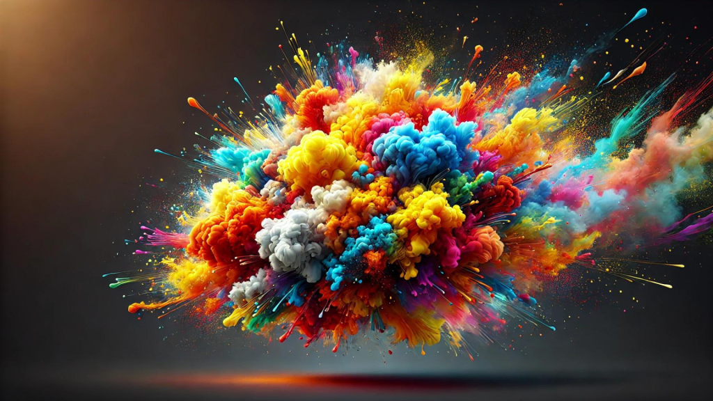
Color theory is a cornerstone of web design, essential for creating visually appealing and effective websites. Understanding how colors interact and affect human psychology can greatly enhance user experience and guide user behavior. Here’s a breakdown of key aspects of color theory in web design and how to use them effectively.
Emotional Impact
Colors evoke emotions. Blue can convey trust and calmness, making it a favorite for financial institutions. Red, associated with energy and urgency, is often used for call-to-action buttons. Choosing the right colors with tools like Elementor can create the desired emotional response and guide users’ actions on a site.

The Psychology Behind Colors
- Blue: Often used by banks and corporate websites, blue signifies trust, professionalism, and calmness. It is a color that fosters a sense of security.
- Red: Red commands attention and creates a sense of urgency. It is ideal for call-to-action buttons and sales promotions.
- Green: Symbolizing nature and tranquility, green is perfect for environmental and wellness sites.
- Yellow: This bright color signifies happiness and optimism but should be used sparingly to avoid visual fatigue.
Contrast and Readability
High contrast between text and background improves readability and user experience. For instance, black text on a white background is the most readable combination. However, too much contrast, like bright yellow on white, can be jarring and difficult to read.
Implementing Contrast for Better UX
Contrast Tips:
- High Contrast: Black text on a white background is the gold standard for readability.
- Moderate Contrast: Soft contrasts, like dark gray on light gray, can reduce eye strain for extended reading.
- Avoid Low Contrast: Bright colors against bright backgrounds can be hard to read and may deter users.

Color Harmony
Harmonious colors create balance and visual interest. Using a color wheel, designers can choose complementary colors (opposite each other on the wheel) or analogous colors (next to each other on the wheel) to create a cohesive look. For example, a blue and orange palette can add vibrancy to a design, while blues and greens can evoke a serene atmosphere.
Achieving Color Harmony
- Complementary Colors: Pairing colors like blue and orange can make elements stand out while maintaining balance.
- Analogous Colors: Colors next to each other on the color wheel, such as blue and green, create a soothing, cohesive look.
- Triadic Colors: Using three evenly spaced colors on the color wheel, like red, yellow, and blue, can add dynamic vibrancy.

Accessibility
Consider color blindness and visual impairments in your design. Avoid color combinations that are problematic for color vision deficiencies, such as green & red or blue & purple. Tools like Elementor also offer accessibility options to help ensure your website is inclusive to a wider audience.
Designing for Accessibility
- Color Blindness: Use patterns and textures in addition to colors to convey information.
- Contrast Ratios: Ensure text stands out from the background with adequate contrast ratios.
- Assistive Tools: Utilize tools like color contrast analyzers to check accessibility.
Branding Consistency
Consistent use of color strengthens brand recognition. Ensure that the colors on your website align with your overall brand strategy. This consistency helps users easily identify your brand across various media.
Maintaining Brand Consistency
- Brand Guidelines: Develop a style guide that outlines your brand’s color palette.
- Consistency Across Media: Use the same colors in your web design as in your logos, advertisements, and other branding materials.
- Psychological Consistency: Ensure the emotional tone of your colors aligns with your brand message.
Beyond visual design, streamlining your development process is equally essential for consistency and efficiency. Learn how workflow automation can accelerate web development and free up time for more creative and strategic design decisions.

Modern Web Design Trends
In the realm of modern web design, color theory remains a fundamental element. Current trends emphasize minimalism, often utilizing monochromatic color schemes with strategic splashes of color for emphasis. This approach not only adheres to UX design principles but also enhances user-centered design by focusing on content and usability over excessive decoration. Alongside color, custom fonts integration in CSS plays a vital role in shaping visual hierarchy and reinforcing brand identity.
Best Web Design Software for Color Management
- Adobe Color: A powerful tool for creating and exploring color schemes.
- Sketch: Offers advanced features for color manipulation and palette creation.
- Figma: Collaborative design tool with robust color management features.
UX Best Practices
Applying color theory within ux best practices involves more than just choosing appealing colors. It requires an understanding of user behavior, accessibility, and the overall user journey.
Integrating Color Theory in UX Design
- User Research: Understand your audience and their preferences to select colors that resonate with them.
- Testing: Conduct A/B tests to see how different color choices impact user behavior.
- Feedback: Collect user feedback to continually refine your color strategy.
Final Thoughts
Implementing color theory effectively can significantly boost the aesthetic appeal and functionality of a website. By understanding the psychology of color and applying principles of color harmony and contrast, designers can create more engaging and user-friendly websites. Adhering to ux design principles and focusing on user-centered design ensures that your website not only looks good but also provides an optimal user experience. Utilizing the best web design software can further enhance your ability to create stunning and effective designs that captivate and retain users.
Modern Web Design Trends
In the realm of modern web design, color theory remains a fundamental element. Current trends emphasize minimalism, often utilizing monochromatic color schemes with strategic splashes of color for emphasis. This approach not only adheres to ux design principles but also enhances user-centered design by focusing on content and usability over excessive decoration.
Best Web Design Software for Color Management
- Adobe Color: A powerful tool for creating and exploring color schemes.
- Sketch: Offers advanced features for color manipulation and palette creation.
- Figma: Collaborative design tool with robust color management features.
UX Best Practices
Applying color theory within ux best practices involves more than just choosing appealing colors. It requires an understanding of user behavior, accessibility, and the overall user journey.
Integrating Color Theory in UX Design
- User Research: Understand your audience and their preferences to select colors that resonate with them.
- Testing: Conduct A/B tests to see how different color choices impact user behavior.
- Feedback: Collect user feedback to continually refine your color strategy.

Final Thoughts
Implementing color theory effectively can significantly boost the aesthetic appeal and functionality of a website. By understanding the psychology of color and applying principles of color harmony and contrast, designers can create more engaging and user-friendly websites. Adhering to ux design principles and focusing on user-centered design ensures that your website not only looks good but also provides an optimal user experience. Utilizing the best web design software can further enhance your ability to create stunning and effective designs that captivate and retain users.
Modern Web Design Trends
In the realm of modern web design, color theory remains a fundamental element. Current trends emphasize minimalism, often utilizing monochromatic color schemes with strategic splashes of color for emphasis. This approach not only adheres to ux design principles but also enhances user-centered design by focusing on content and usability over excessive decoration.
Best Web Design Software for Color Management
- Adobe Color: A powerful tool for creating and exploring color schemes.
- Sketch: Offers advanced features for color manipulation and palette creation.
- Figma: Collaborative design tool with robust color management features. Elementor also integrates well with these tools, allowing for seamless color management within web design projects.
UX Best Practices
Applying color theory within ux best practices involves more than just choosing appealing colors. It requires an understanding of user behavior, accessibility, and the overall user journey.
Integrating Color Theory in UX Design
- User Research: Understand your audience and their preferences to select colors that resonate with them.
- Testing: Conduct A/B tests to see how different color choices impact user behavior.
- Feedback: Collect user feedback to continually refine your color strategy.

Final Thoughts
Implementing color theory effectively can significantly boost the aesthetic appeal and functionality of a website. By understanding the psychology of color and applying principles of color harmony and contrast, designers can create more engaging and user-friendly websites. Adhering to ux design principles and focusing on user-centered design ensures that your website not only looks good but also provides an optimal user experience.
Utilizing the best web design software can further enhance your ability to create stunning and effective designs that captivate and retain users. Discover how Owltek Solutions can transform your online presence with their innovative web design services!
