In the digital marketplace, the effectiveness of a website is often measured by its conversion rate—the percentage of visitors who take a desired action. Design plays a pivotal role in guiding users towards these actions, whether it’s making a purchase, signing up for a newsletter, or filling out a contact form. By leveraging modern web design, adhering to UX best practices, and using the best web design software like Elementor, you can significantly enhance your website’s conversion rates. Here are several key conversion-focused design techniques that can help boost conversions on your website.
Clear Calls to Action (CTAs)
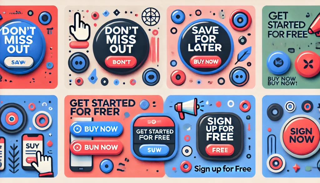
Your call to action should be the most prominent element on the page. Use vibrant colors that stand out from the rest of the design, and ensure the messaging is direct and compelling. Phrases like “Sign Up Free” or “Get Started Today” coupled with large, clickable buttons can significantly increase conversion rates.
Placement and Design of CTAs
The design and placement of CTAs are crucial for their effectiveness. Here are some techniques to consider:
- Color and Contrast: Choose a color that contrasts sharply with the rest of your page to draw attention. For instance, if your website has a predominantly blue theme, a bright orange or red CTA button can stand out.
- Size and Shape: Make sure the CTA is large enough to be noticeable but not overwhelming. The shape can also influence its effectiveness; rounded edges often perform better than sharp ones.
- Messaging: Use clear, concise, and action-oriented language. Instead of generic phrases like “Submit,” use more engaging phrases like “Join Now” or “Get Your Free Trial.”

Simplified Forms
The fewer barriers to completion, the better. Simplify forms to the essentials, and use conversion-focused design techniques like progressive disclosure to not overwhelm the user. Asking for too much information upfront can deter users from completing a form. Instead, start with basic requests and gradually ask for more details.
Techniques for Simplified Forms
Simplifying forms can significantly reduce friction for users and increase the likelihood of form completion. Here are some best practices:
- Minimize Fields: Only ask for the information you absolutely need. For example, if you are offering a newsletter signup, an email address might be sufficient.
- Inline Validation: Provide immediate feedback as users fill out the form. This can help prevent errors and reduce frustration.
- Step-by-Step Process: Break longer forms into multiple steps to make them feel less daunting. For example, an e-commerce checkout process can be divided into sections for shipping information, billing details, and order review.

Trust Signals
Incorporate elements that enhance credibility and trust, such as testimonials, client logos, and security badges, especially on landing pages and checkout processes. These elements reassure users that their data and transactions are secure, which can be a decisive factor in converting browsers into buyers.
Types of Trust Signals
Building trust with your visitors is essential for conversions. Here are some effective trust signals to consider:
- Testimonials: Real user reviews and testimonials build credibility. Display these prominently on your website, particularly on landing pages and near CTAs.
- Client Logos: Displaying logos of well-known clients can enhance trust. This is especially effective for B2B websites.
- Security Badges: Showcasing security certifications, such as SSL certificates or payment gateway certifications, reassures users about the safety of their data.

Responsive and Fast-Loading Design
Ensure your website is responsive and loads quickly on all devices. A delay of even a few seconds can lead to frustration and increased bounce rates, which negatively impacts conversions. Optimize images, leverage browser caching, and minimize the use of heavy scripts to enhance site speed.
Best Practices for Responsive Design
Creating a responsive and fast-loading website is crucial for user experience and conversions. Here are some strategies:
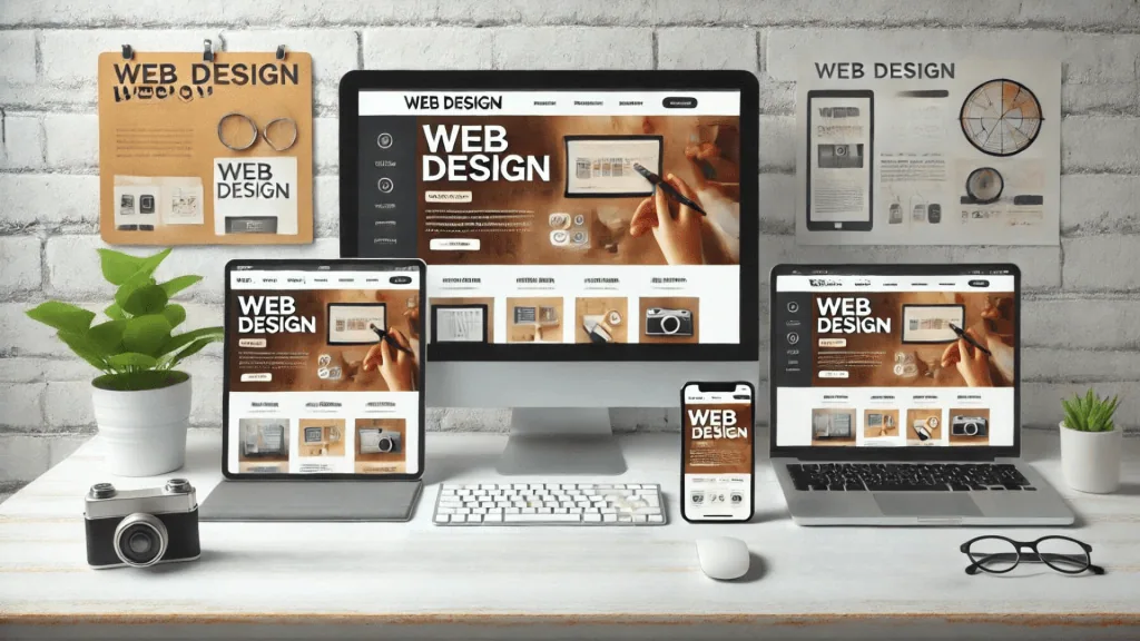
- Mobile Optimization: Ensure your site is fully functional on mobile devices. Use responsive design techniques to adapt your layout to different screen sizes.
- Speed Optimization: Use tools like Google PageSpeed Insights to test and improve site loading speeds. Optimize images, use content delivery networks (CDNs), and minimize HTTP requests.
- Flexible Layouts: Use flexible grid layouts that adapt to different screen sizes, such as those outlined in our guide to CSS Grid layout techniques. This ensures a consistent experience across all devices.

Use of White Space
While it may seem counterintuitive, incorporating plenty of white space can actually help direct attention to your CTAs and essential information. A cluttered website can distract users from the main conversion points.
Benefits of White Space
White space, also known as negative space, is the area between design elements. Here’s why it’s important:
- Improves Readability: White space makes content easier to read and digest. It prevents the page from feeling too crowded and overwhelming.
- Focuses Attention: Helps guide users’ eyes to the most important elements, such as CTAs and key information.
- Creates Balance: Gives the design a clean and balanced look, which can enhance user experience and increase conversions.
Leveraging Modern Web Design Trends
Modern web design trends can significantly influence conversion rates. Staying up-to-date with these trends ensures that your website not only looks contemporary but also provides an optimal user experience.
Key Trends in Modern Web Design
Incorporating modern web design trends can make your website more appealing and functional. Here are some trends to consider:
- Minimalism: Simple, clean designs with plenty of white space. Minimalist designs focus on the essentials and avoid unnecessary elements.
- Microinteractions: Small animations or design elements that respond to user actions. These can enhance user experience and engagement.
- Bold Typography: Using large, bold fonts to grab attention. This can be particularly effective for headlines and key messages.

Best Web Design Software for Conversion Optimization
Using the best web design software like Elementor can streamline the process of creating conversion-focused websites. Tools like Adobe XD, Sketch, and Figma offer robust features that cater to UX design principles and user-centered design approaches.
Features to Look for in Web Design Software
When choosing web design software, look for features that support conversion optimization:
- Prototyping Capabilities: Allows for the creation of interactive prototypes to test design concepts. This can help you refine your design before it goes live.
- Collaboration Tools: Facilitates teamwork and feedback. Features like shared libraries and real-time collaboration can improve efficiency.
- Ease of Use: Intuitive interfaces that don’t require steep learning curves. This ensures that you can quickly create and iterate on designs.
Integrating UX Best Practices
Adhering to UX best practices is crucial for designing websites that convert. Focus on creating a seamless, enjoyable user experience that encourages visitors to take action.
Core UX Design Principles
Implementing UX best practices can significantly improve your website’s effectiveness. Here are some principles to follow:
- Consistency: Ensure consistent design elements throughout the site. This includes fonts, colors, and button styles.
- Simplicity: Keep the design simple and intuitive. Avoid unnecessary complexity that can confuse users.
- Feedback: Provide feedback to users for their actions, such as form submissions. This can be in the form of success messages or visual indicators.
Embracing User-Centered Design
User-centered design places the user at the forefront of the design process. By understanding the needs, preferences, and behaviors of your target audience, you can create a website that not only attracts visitors but also converts them into customers through conversion-focused design techniques.
Steps to Achieve User-Centered Design
To implement user-centered design, follow these steps:
- User Research: Conduct surveys, interviews, and usability tests to gather insights. This helps you understand your users’ needs and pain points.
- Personas: Create detailed user personas to guide design decisions. Personas represent your target users and help ensure your design meets their needs.
- User Testing: Continuously test and iterate designs based on user feedback. This ensures that your design remains effective and user-friendly.

By implementing these conversion-focused design techniques, leveraging modern web design trends, and adhering to UX design principles, you can create a more intuitive and persuasive user experience. This approach encourages more of your visitors to take the desired actions, ultimately boosting your website’s overall effectiveness.
Modern web design, when paired with the best web design software like Elementor and guided by UX best practices, can significantly enhance your website’s performance. Embracing user-centered design ensures that your site not only meets the needs of your users but also drives them towards conversion. To take your conversion strategy even further, learn how integrating CRM into your sales processes can align your marketing and sales efforts for better results. Discover how Owltek Solutions transforms web design into captivating digital experiences. Explore our innovative solutions today!
