The CSS Grid Layout is a powerful, two-dimensional system that enables developers to create complex web designs easily and consistently across different browsers. It’s a game-changer for web design, allowing for more flexible and sophisticated layouts compared to older CSS layout techniques. Elementor is a popular tool that leverages these modern capabilities, enabling even more streamlined design processes. Here’s an overview of essential CSS Grid layout techniques that can enhance your web design projects.
Defining a Grid Container
To utilize CSS Grid, first declare a container element as a grid with display: grid;. This setting turns the children of the container into grid items. From there, you can define columns and rows using grid-template-columns and grid-template-rows. For instance, you can set up a basic grid layout like this:
.container {
  display: grid;
  grid-template-columns: repeat(3, 1fr);
  grid-template-rows: repeat(2, 100px);
}
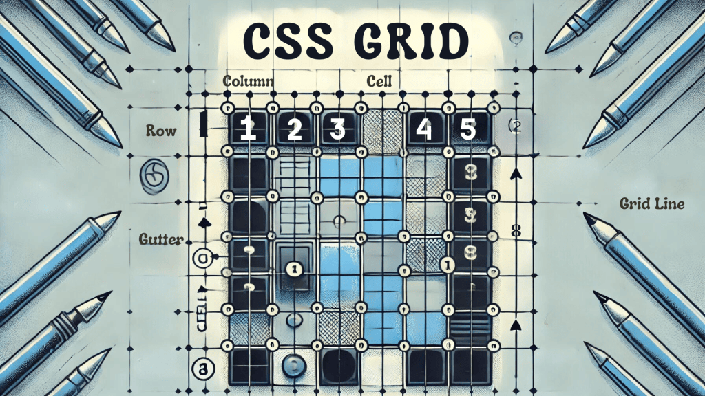
This code snippet creates a grid container with three equal columns and two rows, each 100 pixels tall.
Example Image: A simple grid layout with defined columns and rows.

Fractional Units and Repeat Function
One of the strengths of CSS Grid is the introduction of fractional units (fr), which allow you to distribute container space dynamically between grid items. The repeat() function simplifies the creation of complex grids by allowing you to repeat columns or rows efficiently. For example:
.container {
  display: grid;
  grid-template-columns: repeat(4, 1fr);
}
In this example, repeat(4, 1fr) creates four equal columns, each taking up one fraction of the available space. This feature is incredibly useful for creating flexible layouts that adapt to different screen sizes and content amounts.
Grid Gap
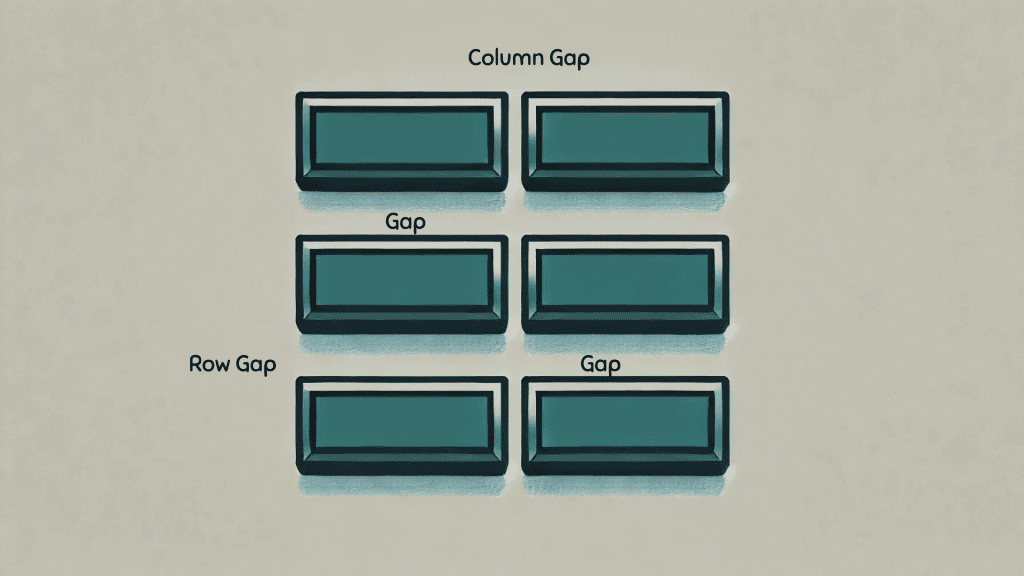
Spacing between grid items can be easily managed without the need for margin hacks. grid-gap, row-gap, and column-gap properties let you set the gaps directly within the grid layout. For instance:
.container {
  display: grid;
  grid-template-columns: repeat(3, 1fr);
  grid-gap: 20px;
}
This setup creates a grid with three equal columns and a 20-pixel gap between each item. This method is more straightforward and cleaner than using margins for spacing.

Placing Items in the Grid
CSS Grid gives you complete control over where items are placed. Use grid-column and grid-row to specify the start and end lines for each item, or use shorthand techniques to place items exactly where you want them. For example:
.item1 {
  grid-column: 1 / 3;
  grid-row: 1 / 2;
}
This code places the first item to span across the first and second columns and occupy the first row. This precise control allows for creating intricate and dynamic layouts with ease.
Responsive Design
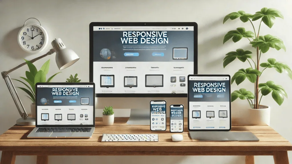
CSS Grid makes responsive design more straightforward. By combining media queries with grid properties, you can adapt your layouts to different screen sizes with minimal effort. For example, you can change grid-template-columns and grid-template-rows to adjust to various displays:
@media (max-width: 600px) {
  .container {
    grid-template-columns: 1fr;
  }
}
This media query adjusts the grid layout for screens smaller than 600 pixels, creating a single-column layout for better readability on mobile devices.

Layering with Grid Areas
Define grid areas with grid-template-areas to assign named areas in your layout, which simplifies the placement of elements and enhances the readability of the layout structure. For example:
.container {
  display: grid;
  grid-template-areas:
    'header header header'
    'sidebar main main'
    'footer footer footer';
}

.header {
  grid-area: header;
}

.sidebar {
  grid-area: sidebar;
}

.main {
  grid-area: main;
}

.footer {
  grid-area: footer;
}
This setup creates a grid with distinct areas for the header, sidebar, main content, and footer, making the layout structure easy to understand and manage. Elementor can be utilized to further simplify the creation of such layouts by providing a user-friendly interface for arranging these grid areas.
CSS Grid Layout is a robust tool that encourages creativity in web design while maintaining clean and manageable code. By mastering these techniques, developers can build responsive, aesthetically pleasing websites that stand out in today’s digital landscape. For a full breakdown of advanced strategies, visit our comprehensive guide on mastering web layouts with CSS Grid.
Exploring Backend Frameworks for Web Development
In the realm of web development, backend frameworks play a crucial role. But what does framework mean in this context? A framework provides a standardized way to build and deploy applications. Web development frameworks offer reusable code, tools, and libraries to streamline development processes.
What is a Framework?
A framework is essentially a structure that serves as a foundation for building software applications. It provides predefined classes and functions to manage hardware devices, interact with system software, and handle input and output operations. CSS grid layout techniques are often utilized in conjunction with frameworks to create responsive and organized web designs. For more insights into how grid systems shape both structure and aesthetics in web design, check out our article on grid systems in web design. Framework examples in web development include popular options like Django, Laravel, and ExpressJS.
Benefits of Web Frameworks
Web frameworks simplify the development process by offering built-in functionalities like user authentication, database management, and URL routing. They also promote code reuse and consistency across projects. This means developers can focus more on the unique aspects of their applications rather than reinventing the wheel.
Popular Web Development Frameworks
Some of the most widely used web development frameworks include:
- Django: A high-level Python framework that encourages rapid development and clean, pragmatic design.
- Laravel: A PHP framework known for its elegant syntax and robust features.
- Express.js: A minimal and flexible Node.js web application framework that provides a robust set of features for web and mobile applications.
These backend frameworks help developers create efficient, scalable, and maintainable applications.
Understanding What is Web Application
A web application is a software application that runs on a web server, unlike computer-based software programs that run locally on the operating system of the device. Web applications are accessed through web browsers over a network such as the Internet or an intranet.
Importance of Authentication Methods
Authentication methods are essential for securing web applications. They verify the identity of users before granting them access to resources. Strong authentication methods ensure that only authenticated users can access sensitive information. Identity authentication can be done through various means such as passwords, biometrics, and two-factor authentication.
User Authentication and Security
User authentication is a critical aspect of web application security. It involves verifying the identity of a user to ensure they are who they claim to be. This process often involves using phone password ideas, which are methods to create secure and memorable passwords.

Advanced Authentication Techniques
Strong authentication techniques go beyond simple password protection. They include multi-factor authentication (MFA), which requires two or more verification methods, and biometric authentication, which uses physical characteristics like fingerprints or facial recognition.

Ensuring Secure User Authentication
To maintain a secure web application, it’s crucial to implement robust user authentication mechanisms. This includes using encryption for password storage, regular security audits, and educating users about creating strong passwords.
Final Thoughts
Mastering CSS Grid Layout and understanding backend frameworks are essential skills for modern web developers. Elementor can complement these tools, allowing developers to create visually appealing and functional websites with ease. CSS Grid provides a powerful tool for creating flexible and responsive web designs, while backend frameworks streamline the development process and enhance application functionality. Additionally, implementing strong authentication methods is crucial for securing web applications and protecting user data.
By integrating these techniques and tools, developers can build sophisticated, secure, and visually appealing web applications that meet the demands of today’s digital landscape. Understanding what is a framework and what is web application can significantly enhance a developer’s ability to create robust, user-friendly web solutions. Whether you’re using backend frameworks like Django, Laravel, or Express.js, or implementing advanced authentication methods, mastering these skills will position you at the forefront of web development.

In conclusion, the synergy between CSS Grid Layout, css grid layout techniques, backend frameworks, and strong authentication methods ensures that developers can create high-quality web applications. These tools not only improve the efficiency and functionality of web projects but also enhance the overall user experience. As web development continues to evolve, staying updated with the latest frameworks and technologies will be crucial for any developer aiming to excel in this dynamic field. Explore the innovative web development services offered by Owltek Solutions to elevate your digital presence!
