CSS Tricks For Beginners: Enhancing Your Web Designs
Reading time: 7 minutes
Cascading Style Sheets (CSS) is a powerful tool for web developers, allowing them to create visually appealing and efficient designs. Whether you are a seasoned developer or just starting, mastering CSS is crucial for building modern, user-friendly websites. In this article, we will explore essential css tricks for beginners and techniques that can help you get started and make your web pages stand out. Additionally, we will discuss the integration of modern web design, Elementor, the best web design software, and UX best practices..
Understanding the Basics
The Importance of the Box Model
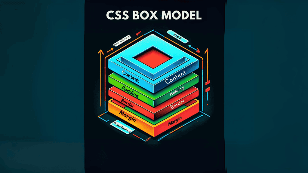
Understanding the CSS box model is crucial for any web developer. It consists of margins, borders, padding, and the content area. This model is fundamental for controlling layout and spacing in your web designs. Using the property box-sizing: border-box; ensures that padding and border sizes are included in the total width and height of your elements, simplifying layout design and making it easier to achieve precise spacing and alignment.
Flexbox for Responsive Layouts
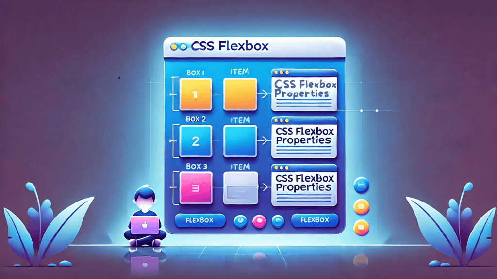
Flexbox is a layout module that makes it easier to design flexible, responsive layout structures without using float or positioning. By mastering properties like justify-content, align-items, and flex-direction, you can control the distribution of space and alignment of items within a container. Flexbox is a critical tool in modern web design, allowing for complex layouts to adapt seamlessly to different screen sizes.
Leveraging CSS Variables
CSS variables, also known as custom properties, can streamline your code and make it more maintainable. Define a variable once, such as --main-color: #333;, and use it throughout your stylesheet. This makes it easier to maintain and update styles, as changes to variables automatically apply wherever they’re used. This technique is especially useful in large projects where consistency and ease of updates are vital.
Enhancing User Experience
Implementing Hover Effects
Hover effects are a simple yet effective way to enhance user interaction. Using the :hover pseudo-class, you can change styles when a user’s mouse hovers over an element. This can be applied to buttons, links, or any element where you want to provide visual feedback. Well-implemented hover effects are part of UX best practices, contributing to a more engaging and intuitive user experience.
Media Queries for Responsive Design
Media queries are essential for creating responsive websites. They allow CSS to apply only under certain conditions, like specific screen sizes. For those looking for css tricks for beginners, adopting a mobile-first approach is a great way to start. You can start with styles for smaller screens and use media queries to add styles as the screen size increases. This ensures that your website looks great on all devices, from smartphones to desktops.
The Clearfix Hack
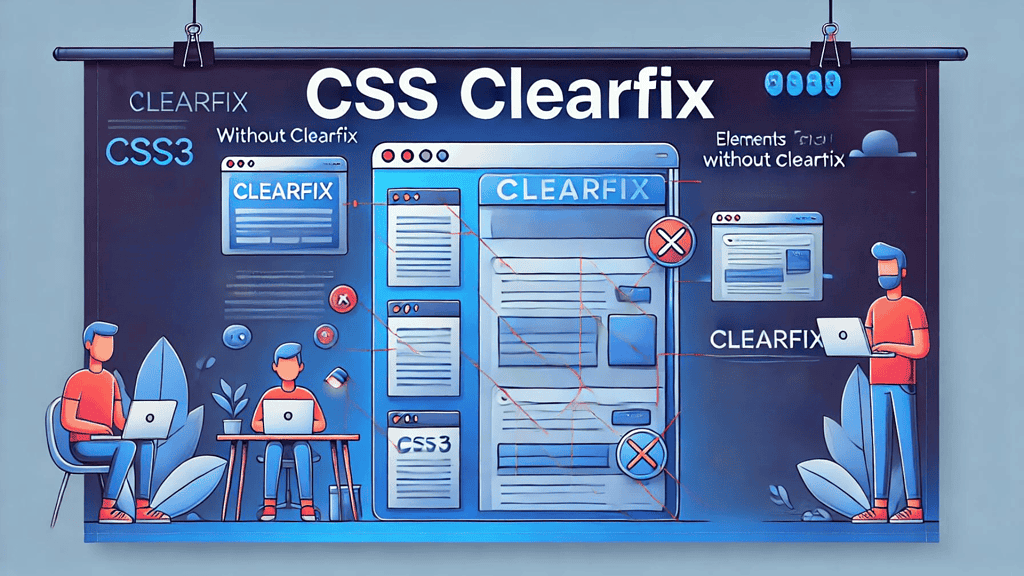
Floating elements can cause issues with container heights, leading to unexpected layout problems. The clearfix hack is a technique to ensure containers wrap around floated elements correctly. By applying the pseudo-element ::after with clear: both; to the container, you can maintain a proper layout. This is a handy trick to ensure your designs remain intact regardless of the elements they contain.
Tools and Techniques
Choosing the Best Web Design Software
Selecting the best web design software is a critical step in your development process. Tools like Adobe XD, Sketch, and Figma offer powerful features for creating and prototyping modern web designs. These tools provide intuitive interfaces and robust functionality, making it easier to translate your design ideas into functional websites. Additionally, many of these tools integrate seamlessly with Elementor, popular development environments, streamlining the transition from design to code.
Embracing User-Centered Design
User-centered design (UCD) is a philosophy that places the user at the forefront of the design process. By understanding your users’ needs, preferences, and behaviors, you can create more effective and satisfying web experiences. This approach involves iterative testing and feedback, ensuring that the final product aligns with user expectations. UCD is closely related to UX design principles, emphasizing usability, accessibility, and overall user satisfaction.
Applying UX Design Principles
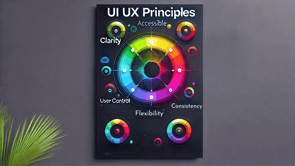
UX design principles are guidelines that help create more intuitive and user-friendly interfaces. These principles include simplicity, consistency, feedback, and accessibility. By adhering to these principles, you can improve the overall user experience on your website. Ensuring that your design is easy to navigate, visually consistent, and accessible to all users, including those with disabilities, is key to achieving a successful web presence.
Advanced Techniques
Mastering CSS Grid
CSS Grid is another powerful layout system that allows for the creation of complex, responsive layouts with ease. Unlike Flexbox, which is primarily one-dimensional, CSS Grid enables two-dimensional layouts, making it ideal for more complex designs. By learning properties such as grid-template-columns, grid-template-rows, and grid-gap, you can create intricate and highly responsive layouts that adapt to any screen size.
Using Advanced Selectors
Advanced CSS selectors allow for more precise targeting of elements in your HTML. Selectors like :nth-child, :nth-of-type, and attribute selectors [attribute=value] can be used to apply styles to specific elements based on their position, type, or attributes. These selectors provide greater control and flexibility, enabling you to apply styles in a more targeted and efficient manner.
Integrating Animations and Transitions
Animations and transitions can add a layer of interactivity and visual appeal to your website. CSS provides several properties, such as transition, animation, and keyframes, that allow you to create smooth and engaging animations. These can be used to enhance user interactions, draw attention to important elements, or simply add a touch of elegance to your design.

Final Thoughts
Mastering CSS is an ongoing journey, and these tips and tricks are just the beginning. By understanding the box model, utilizing Flexbox and CSS Grid, leveraging CSS variables, and incorporating hover effects, media queries, and advanced selectors, you can create modern, responsive, and visually appealing web designs. Additionally, embracing UX design principles and user-centered design, and choosing the best web design software like Elementor, will ensure that your websites are not only beautiful but also user-friendly and effective. For those just starting, css tricks for beginners are essential to building a strong foundation in web design.
Remember, the key to becoming proficient in CSS and web design is continuous learning and experimentation. Stay updated with the latest trends, tools, and CSS tricks for beginners in modern web design, and always strive to improve your skills. By doing so, you’ll be well on your way to creating stunning websites that provide exceptional user experiences. Explore the innovative web design services offered by Owltek Solutions to elevate your online presence!
**This post contains affiliate links, meaning I may earn a small commission if you make a purchase through one of them. Rest assured, I only recommend products I truly love. Your support helps keep my creative business thriving — thank you!**

